
Brand expression explorations
Some early explorations from the recent brand expression update

Unused icon bbs

Snorkelers

A teeny Winnebago driving into the sunset

Part of a color test

That Winnebago again

Big pile of rocks

Suuuper early explorations around how we might want to represent humans, before we updated the color palette.
Making Moves
I've realized that, in the process of hyping my new brand (mostly to my mom, who, as far as I know, is the only regular reader of this plog, and who I suspect only does so because I threaten her on the regular with a total freeze on info about my personal life until she reads it*) I've referred at least once to my old brand without explanation of what my old brand actually looked like. I am still very fond of my old logo, partly because I think it's funny and I like the eyeballs, but also because it is the first logo I ever created for myself. Personal logos are funny. They are very autobiographical. It's a hoot to be able to look back and be like "oh, yeah, of course-- that is totally representative of 21-year-old Franny."
My very first logo! Put that in the baby book, Ma!
The butterfly was my primary logo and the only bug on my business card, but the rest of my collateral had all three bugs on it in various places, hanging out in and around the margins. It was suggested once or twice that maybe I should stick to one bug per document. My response was always to smile nicely, agree that the chubby grub blinking at the top of my resume might not be for everyone, and then never talk to that person again.
One time I actually went home and defiantly added some ants to the margins of my resume, the logic being that if somebody didn't like me based on the number of googly-eyed bugs on my resume, then I probably didn't want to work for them anyway. Things have worked out surprisingly well for me despite having bugs all over my collateral.
These little dudes went on all of my old collateral, too. Googly bugz 4eva.
I've grown a lot since those days, though. The sweet naivete of my super-early twenties has given way to the jaded maturity and wisdom of my slightly-later-early twenties, and I am now firmly situated in the infinitely sophisticated era of the toast + jam.
*I'm kidding. I do not regularly threaten my mother.
The Original
The piece of toast that started it all.
Toast.
I'm Toast
Creating the collateral for my recent personal rebranding was a classic example of Franny Has An Over-The-Top Idea And Makes It Work In The End But Creates A Lot Of Extra Work For Herself Along The Way (see layered composite of 9 different apples). My deep aversion to making anything that might be labeled 'normal' is what fuels the impulse to complicate otherwise basic projects. It is also what gets me in over my head more often than I admit. The 4-piece bread-shaped business cards with sliding inner panel are a good example of the impulse in action.
Stack on stacks. First trim done.
Every piece of the 4-piece card has two dielines -- one for cutting out of the parent sheet, and another for the final trim after all the pieces have been layered and glued.
It really works out well for me that one of the scenarios in which I am at my happiest is sitting at a cutting mat slicing things out of paper or cardboard. It helps, too, that gluing pieces of paper together to make bigger, thicker, different pieces of paper is another of my favorite pastimes. My life would look very different if I didn't love fiddling with paper so much.
Card carnage. Cardnage (??)
The jury is still out on whether my preoccupation with abnormality is a unique strength or a crippling weakness.
Regardless, I think it worked this time. So that's good news.
It's Happeningggg!!!!
World sticker domination, one sticker at a time. Came across this bad thang outside of Toronado last night!

Glittery Sailor Moon + ATG = dream team
I Made Stickers
Arm teenage girls. Justice system = fixed.
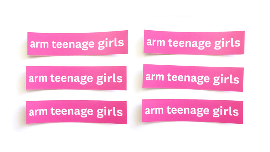
Because duh.
A Bunch of Dice
This is some concept art I came up with for a game that was in development at FPC a few months ago. The game is a social dice game where you roll all the dice and people call out matching groups of dice by shape, color, and number.
For the design I borrowed the foundational aspects of game play -- shape and color -- and used them as the basis for the branding and packaging.

Branding concept

Shapes for the sides of the dice.
I though it would be cool to package the dice in a cube-shaped box and illustrate the sides with geometric shapes in colors evocative of the dice themselves.
The first color scheme I picked looked nice but the colors were not immediately recognizable by name, which would make game play clunky and less intuitive. Players need to be able to call out colors and shapes without having to think about what the correct name for that particular shade of pea green is.

Nice colors, but not easy enough to name when you're under pressure. "Orange star!" "Pink moon!" "Puce flower!" "That's not puce." "Really? It looks like puce." "Not puce." "What is puce?" etc., etc......

Second color scheme. Similar to first but colors are more easily distinguishable from one another which is crucial for game play.
Eventually it was decided that the direction I was headed in was not targeted enough at the bigger buyers and we needed a more commercial, slightly less "high end" look and feel. It's always disappointing when an idea gets scrapped because it is "too nice", but apparently you have to sell games in order to make money. Crazy. Really fun project, though!
This is too funny
Joyce Taylor from KING 5 news is wearing the BOOM scarf I designed for Threads for Twelves. LOOOOOLLLLLLLOLOL can you believe it this is too good! Boom shaka laka.

Concrete Summer Learning Adventure
This is a logo I designed for another project I did with the Concrete School District. The logo is for Concrete Summer Learning Adventure, a free summer camp run by the school district in conjunction with the National Parks Service, the North Cascades Institute, and Western Washington University (go vikes). For six weeks campers focus on exploring local ecosystems, and by the end of camp everybody becomes certified as a Cascade National Park Junior Ranger.
I wanted the logo to be playful while also including elements from nature as well as a nod to the National Park Service (the arrowhead). I tucked the Concrete, Washington concrete silos the town is named after in there for a little sense of place action.

Flora in Progress
I've got flora on flora on flora in the works right now! I have been taking my time and making slow but sure progress on my papier mache cacti farm and I am having a very very good time.

Cacti in various stages of undress

Soon-to-be leaves, petals, and cactus suits.

First try with the crepe paper wrap.

Experiments in how to best structure a cactus flower.
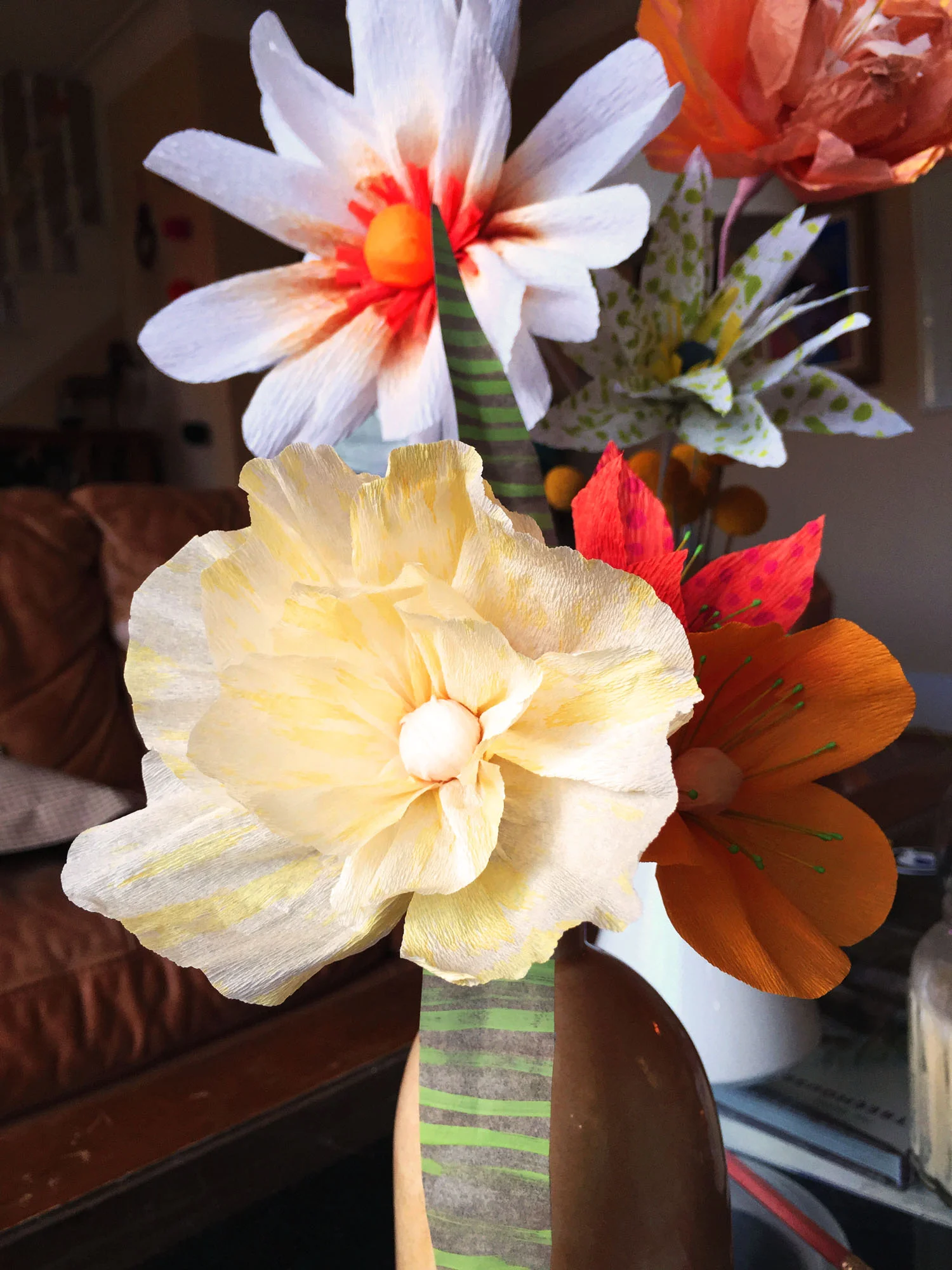
Flowers, pt. deux
Flowerzflowerzflowerzflowerz.


Flowerzz
Paper flowers! One more project on the list of current/ongoing messes living on our kitchen table. Whats a little more paper and glue on an already very large pile of paper and glue???
We've got a very healthy crafting situation going on right now in our dining room. My roommates and I don't see each other super regularly because our work schedules are all different, but when we're all at home we gather around our big dining room table and drink tasty beverages and chat and make stuff. It is a SUPER pleasing and cozy Winter-time scenario. We've actually been eating meals on the coffee table in the living room because there isn't any room for plates on our d̶i̶n̶i̶n̶g̶ ̶r̶o̶o̶m̶ craft table. We've been making ALL KINDS of adult lifestyle decisionz of late and I LOVE IT.


Cacti
Don't ask my roommates about cacti. There are papier mache cacti in various stages of construction ALL OVER our kitchen table/house/everywhere. I'm pretty into them right now.

KURSSIVV?!?
Quick sketch for work. We won't use it because youngunz can't really read cursive, which is understandable when you're 4. Apparently no one is teaching it in school anymore, either, which is an issue that we don't need to discuss immediately. But flip. That's no good.

Quailman
Not a thousand percent sure where this is going.

Pretty pretty qailman
New Shoes
I used to draw on a lot of shoes. It's been a minute since my last pair and I don't really do it much anymore, but when my big brother made a special request for a pair with purple and grey paisley with skulls, I had to make an exception. How often does your bigger, cooler, Brooklyn-dwelling brother ask you do make him a pair of shoes? And how often does he want them to be purple? With skulls? And paisley?
Not often. Really probably just the one time.
So I'm doing it.
Here is what I have so far:

Will's Purple Paisley Luvv Skullz: Phase I
That is the beginning of shoe #1. I added a few hearts. I'm sure Will will be thrilled!
Still plenty more shoe to cover. Giddyup, purple markers.
Makin' Stuff
I'm very into rope these days. And brass hardware bits. Hardware Sales in Bellingham, Wa is without question THEE place to go for all your hardware and jewelry making needs. Every member of the staff at HS is super sweet, mega knowledgeable, and can take you on a specialized store tour of all the best jewelry findings with the same expertise and joviality as they would identify the specific wingnut you need for your sprinkler system. Really I don't think it gets much better.
Here is the stuff I've made so far:


BOOOOOMMMM
Last month I spent a couple of weeks designing Seahawks shwag for a company called Threads for Twelves. The prototypes showed up a few days ago so I snapped some pixx. It's nuts to me that two weeks ago I sent a vector file halfway across the world and it came back looking like this:

Lovingly hand-knitted in China by a sweet old knitbot

It's almost hard to tell form this terrible photo, but this is a scarf
Head over to Threads for Twelves for all your SeaShwag needs. GO HAWXX!!
Orange You Appealed?
A brewery needed a super quick branding for their new brew called Orange Peel. I was inspired by the rad type on old school citrus crates, so I started from there and distilled it way down to a simple 2-3 color mark.

